Lagoon - Part 3: Biergarten of Eden
As I’ve looked at, Lagoon has many of the familiar trappings of any American theme or amusement park. But it’s not all cheese and stereotypes. Just in time for the 2019 season during which I visited, Lagoon added a German Biergarten area which rivals anything you’d find at a Disney park.
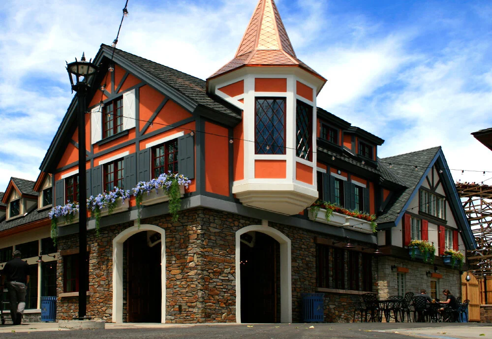
There is no entrance to the area off the main Midway per say. But the boundary of the Biergarten is marked by this prominent structure selling beer and food to go.
The Lagoon Biergarten was meticulously designed and skilfully executed for the park by Salt Lake City’s Coel Studio. Although the way its footprint is situated doesn’t allow for true immersion (the Roller Coaster roars by right next door with nothing but a wood fence in between), this is a solid investment for the park and a most welcome direction for Lagoon to take.
Coel partnered with Wyoming architect Dan Stalker on the themed buildings in a Bavarian style and engaged with EPG for the landscape design. Have a look at the process work and photography at Coel Studio’s project page and their Instagram.
The masterplan is well-plotted and appropriately cinematic. The portion facing the park’s Midway is wide open and inviting.
Walking clockwise (which research suggests most guests in public spaces circulate) you come to a tall clock tower structure with a large archway entrance.
Directly ahead is the interior courtyard space.
The team at Coel working with Dan Stalker Architecture certainly did their thematic homework. This approach to a “weenie” or visual magnet is cribbed directly from the Disney playbook. Here the vantage, scale, and orientation resembles the approach down Main Street U.S.A. to Sleeping Beauty’s Castle.
To the left is additional outdoor seating, with better cover from inclement weather than what is available in the larger, more open front areas of the biergarten.
To the right is the center of the space, anchored by an ornate fountain. The overall approach to the area is large, connected interior spaces diversified and visually parsed by a conglomeration of façades. This suggests structures erected by different proprietors over time instead of designed together. Disney first used this approach with Main Street U.S.A. and then later with the original Fantasyland renovation in the early 1980s. You now find it all their parks. It’s been especially common since the 1990s for new retail and dining complexes, like I’ve found in Michigan and also Wisconsin.
I was impressed by the central water fountain with its wrought iron and gilded elements.
German heraldry is combined with more cute animal iconography. At the top is a golden lion toasting a beer stein in its paw. This is the kind of rigorous detail which is par for the course for Disney, but usually dismissed as unnecessary expense by smaller operations.
The carved blackletter typography pays tribute to Lagoon’s 1886 opening and also the 2019 debut of the biergarten. Wonderful detail, and subtle enough that I almost didn’t see it.
Epcot’s Germany pavilion, 2007.
Of course, I couldn’t help but be reminded of the Germany pavilion or “mini-land” in World Showcase at Walt Disney World’s Epcot park. The area also has its very own biergarten restaurant, though it is strictly an indoor experience and a venue for live entertainment.
The German Biergarten model, which Disney and Lagoon are both trafficking in, is popular in many regions of the United States, particularly in the Midwest. Frankenmuth, Michigan is one such romanticized “European” town that takes authentic the German roots of the region and has transformed itself into a tourist destination through thematic design.
Moving inside, some of the signage is just terrific. I was pleased to discover that according to Coel Studio, Lagoon’s in-house staff was responsible for fabrication of these pieces. The typography is appropriate with quality wood routing and hand painting.
The interior dining space houses two of the largest kitchens in the park. There are 60 total beers on tap, 20 of which are unique. Like Disney and Universal have done in recent years, the menus are flat screen panel displays with appropriately themed graphics and typography.
The simple themed chandeliers are charming and low key, augmented by sunlight streaming down from skylights. The Coel team paid as much attention to the interior details as the outside.
The themed approach to restroom iconography likely did not originate with Disney, but they do it very well and Coel has delivered a version of that approach here at Lagoon.
The typography is consistent all over the complex, manufactured with contemporary substrates when required, but still with Old World touches like the rusted and weathered metal seen here.
There are some subtle elements throughout, like this small bit of stained glass.
One thing which is not as subtle, however, is the biergarten logomark. In fact, I think it’s employed to loudly and frequently. One can hardly blame Coel Studio, as they are a branding consultancy who have a number of brewery clients.
Looking down, it’s even on the manhole cover.
And it’s on every bench and trash can. Although a bit over-logo’d, the Lagoon Biergarten is some top notch thematic design that was meticulously planned and executed on the level that one would expect from Disney or any of the bigger players. I was pleasantly surprised to find this hidden gem at Lagoon (and its beer!) and I hope the park looks to similar design investments in the future.
Oh, and that logo ain’t so bad at all. I even bought the t-shirt.

