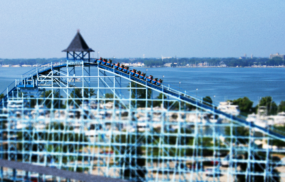
Tilt-A-Whirl.
After so many posts of field observations, I wanted to take a break and just showcase some theme park images without any annotation. Tilt-shift photography, along with high-dynamic-range (HDR) trickery has indeed become a digital cliche during the past decade or so. You see this stuff everywhere online. Disney even got into the act at one point, producing a series of park videos using a tilt-shift effect.
To Shrink Is to Own
I’m reminded of a great passage in Richard V. Francaviglia’s Main Street Revisited: Time, Space, and Image Building in Small-Town America (1996). It’s something of an aside in the closing pages of the book; almost an afterthought. Throughout the text, Francaviglia presents and elaborates upon sixteen axioms of the design and development of the American small town Main Street. The sixteenth is: “The miniaturization of Main Street signifies its acceptance as an integral part of American life and leisure.” He then goes on:
By assuming a place in the home, Main Street joins the ranks of dollhouses and miniature trains as an endearing symbol of America’s past. Miniaturization is, in a sense, the ultimate act in commodification…
That last line sort of blew my mind. What Francaviglia is saying, basically, is that by making something small, we dominate it, we control it, we remake it in our own image; we own it.
Model of the park on display at Disneyland, 2007.
Walt Disney’s fascination with miniaturization is well documented, and the best example is his obsession with model trains. The construction of a small train ride in the backyard of his Holmby Hills home lead directly to the Disneyland project. Walt considered the park a toy at human scale, much like a model railroad. Through Francaviglia’s suggestion, then, when we inhabit the thematic design of Disneyland and places like it, we exert control in the inhabitation, we own the experience. In this way, perhaps, we make the built environment manageable; we make it ours.
New Orleans Square at Disneyland, 2007.
Tilt-shift photography has the effect of making large structures appear as miniatures. For cityscapes and the like, it’s sort of a neat trick. But for the thematic environment, it’s uncannily appropriate. These spaces, designed as they are to feel like a toyscape to be inhabited, look rather remarkable as actual miniatures. In a sense, the tilt-shift effect reveals thematic design for what it really is.
Cedar Point
The best way I’ve found to make this kind of digital technique work in thematic environments is to shoot most photos from a very high place. By digital, I mean that I’m manipulating my images in post production, and I am not creating this effect in-camera with my lens. Thus far, three parks I’ve visited—Cedar Point, Kings Island, and Six Flags Great America—have offered an appropriate vantage. Curiously, in order, those vantages ascend in height. So my lowest shots are from the gondola Cedar Point, and my highest are from the observation tower at Great America.
At Cedar Point, the highest you can get today and take numerous quality photos of the park is from the Sky Ride gondola which spans the Main Midway. I wish I would have had the Von Roll gyro tower Space Spiral to snap even more pics from, but it was removed in 2012.
So here is Cedar Point in tilt-shift. Let’s begin with a ride down the Main Midway.
Now let’s head back in the opposite direction, returning to the park entrance.
Some shot from the ground also turned out pretty well in the tilt-shift look.
Kings Island
At Kings Island, I was able to get even higher. The observation deck on the park’s Eiffel Tower replica is some 264 feet in the air.
Like at Cedar Point, some shots also worked well from the ground.
Six Flags Great America
Finally at Great America, I had the entire park at my disposal via their Sky Trek gyro tower. From this height (nearly 300 feet) and panoramic views of the horizon, the tilt-shift effect gets truly magical.
I wish I was able to photograph the Disney parks in the same way, but not one of them has a remaining gondola ride or observation tower. But at least with Cedar Point, Kings Island, and Great America I have captured—or in Francaviglia’s words, ultimately “commodified”—these parks by miniaturizing them.
Thematic design, pocket-sized.


